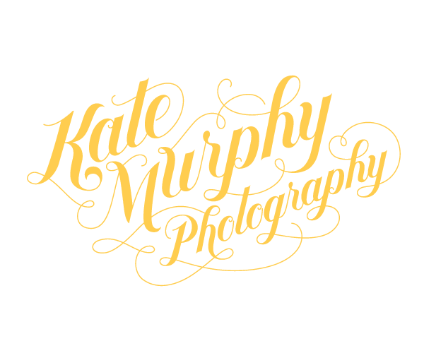
This is the logo and business card design for Kate Murphy Photography. It was designed Jessica Hische who I think has the cutest style! So very girly and with a quirky, vintage twist... Love the yellow and white and colouring on the business card and how she split up the website. Very unique.
One day I will be this good... hopefully.
Again apologies for the lack of posts, so much college work. Right now I should be writing my proposal for my thesis (if only I had a good idea) and I've a major project due next Monday and another one due the week after... I'm set for some serious hair pulling and all I wanna do is watch Mad Men.
Please do bear with me.


I bet you do an excellent business card Rhona!
ReplyDeletelove that font!
ReplyDeleteI love that writing, it kind of reminds me of the font for Butler's Chocolate! Which can only be a good thing :-)
ReplyDelete